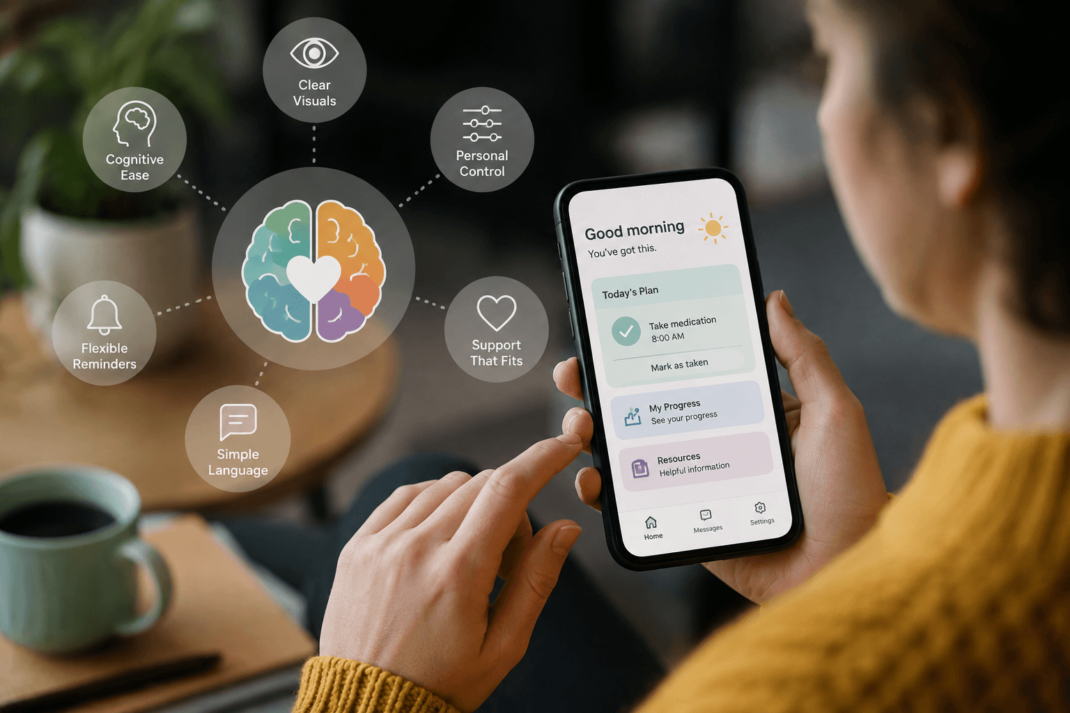
Patient support apps are designed to make healthcare easier. Yet what happens when the app itself becomes another barrier? For people with ADHD, autism, dyslexia, and other forms of neurodivergence, crowded screens, rigid workflows, and constant notifications can make a helpful tool feel exhausting. A neuroinclusive approach to patient app UX offers pharma marketers a better way forward. Instead of expecting every patient to process information and complete tasks in the same way, it creates digital experiences around a wider range of cognitive and sensory needs. As patient support becomes increasingly digital, that shift can make accessibility an important part of engagement rather than an afterthought.
Table of Contents
- Why patient support apps create cognitive barriers
- What neuroinclusive UX for patient apps looks like
- Smarter reminders and more flexible workflows
- Why neuroinclusive design matters for pharma marketers
- Conclusion
- Frequently Asked Questions
Why Patient Support Apps Create Cognitive Barriers
A patient app can technically be accessible while still being difficult to use. That distinction matters because cognitive accessibility involves more than readable fonts, contrast, and screen-reader compatibility.
For example, a person with ADHD may understand every instruction yet struggle with a long, multi-step enrollment process. An autistic patient may find frequent alerts, animations, or unexpected interface changes distracting or overwhelming. Other users may need additional time to process instructions or decide what to do next.
The Centers for Disease Control and Prevention notes that ADHD symptoms can continue into adulthood. Meanwhile, support needs can differ significantly among individuals. Likewise, autistic people vary widely in how they communicate, learn, process information, and manage daily activities.
Therefore, designing around one supposedly “typical” patient can leave important groups underserved. This problem becomes especially important in medication support. Patients may already be managing prescriptions, appointments, side effects, insurance questions, and changes to daily routines. Adding a complicated digital experience creates another demand on their attention.
Instead, neuroinclusive design asks a different question: How much mental effort does the patient need to spend simply using the support program? By reducing unnecessary cognitive load, pharma teams can create digital patient experiences that are easier to navigate and more useful in everyday life.
What Neuroinclusive UX for Patient Apps Looks Like
Good neuroinclusive design starts by reducing unnecessary cognitive load. In practice, that can mean shorter screens, clear labels, predictable navigation, and fewer decisions at each stage.
The W3C cognitive accessibility guidance recommends simple words, short sentences, manageable blocks of information, and clear layouts. Its guidance also encourages designers to make important information easy to find and reduce unnecessary distractions.
For pharma teams, those principles can reshape the patient journey. Instead of presenting eight actions on a dashboard, an app might emphasize the one or two tasks that matter today. Rather than displaying a dense paragraph about a treatment program, it could separate instructions into clear steps. In addition, progress indicators can show patients where they are and what remains.
Choice also matters. Some users prefer detailed information, while others benefit from a simplified view. Therefore, apps can allow patients to reveal more information when they want it instead of placing everything on the first screen.
W3C guidance also recommends supporting simplification when too many features or excessive content could overwhelm users. Importantly, these changes do not only serve people with a diagnosis. A patient dealing with fatigue, stress, pain, or a new treatment may also have limited attention. Consequently, reducing cognitive friction can make the experience easier for a much broader audience.
Smarter Reminders, Flexible Workflows, Better Engagement
Medication reminders seem simple. However, a reminder that arrives at the wrong moment can quickly become background noise.
Many patient apps assume that more notifications create better engagement. However, designing patient apps for cognitive accessibility challenges that assumption. Instead, patients should have meaningful control over when and how reminders appear.
W3C cognitive accessibility guidance recommends allowing users to control interruptions and personalize reminders. It also notes that interruptions can make completing tasks harder for people with attention or memory difficulties.
For example, an adherence program could let patients choose between a push notification, calendar reminder, email, or another supported channel. Patients could also select reminder windows instead of being locked into a single time.
Furthermore, workflows should be forgiving. If someone leaves an enrollment form halfway through, their progress should remain available when they return. If they miss an action, the interface should explain the next step without creating guilt or urgency that is not clinically necessary.
Language matters here as well. A message such as “You missed your dose again” can feel judgmental. In contrast, neutral language can focus attention on what the patient can do next. Ultimately, effective digital adherence support is not about generating more alerts. It is about providing useful support at moments when patients can act on it.
Why Neuroinclusive Design Matters for Pharma Marketers
For pharma marketers, accessibility is closely connected to patient experience. A support program cannot deliver value if patients abandon it because the interface requires too much effort. Therefore, neuroinclusive design should begin before launch rather than appear as a later accessibility fix.
Research and design teams can include neurodivergent patients during interviews, usability testing, journey mapping, and prototype reviews. Moreover, teams should test experiences under realistic conditions instead of assuming every participant has unlimited time and concentration.
That means evaluating practical questions. Can a patient understand the next action within seconds? Can someone pause and return without losing progress? Are important choices obvious? Can notifications be adjusted easily?
These questions turn neuroinclusive UX principles from an abstract inclusion goal into measurable product decisions. They also encourage pharma organizations to reconsider engagement metrics. More taps, sessions, and notifications do not automatically represent a better patient experience. Instead, successful support may mean completing an important task with fewer screens and less effort.
As digital patient engagement expands, that distinction becomes increasingly valuable. Brands that remove unnecessary friction can create support programs that feel more respectful, useful, and human.
Most importantly, neuroinclusive design does not require creating a separate app for every type of brain. Instead, it means building flexibility into the core experience so more people can use it effectively.
Conclusion
Patient support technology should reduce the burden of managing healthcare, not add to it. Yet conventional app design can unintentionally create cognitive and sensory barriers for people with ADHD, autism, and other neurodivergent experiences.
A more neuroinclusive approach to patient app design offers a practical path forward. Clearer interfaces, flexible reminders, predictable workflows, simpler language, and patient control can reduce unnecessary friction.
For pharma marketers, the opportunity goes beyond compliance. Designing for cognitive diversity can help teams create digital patient experiences that are easier to understand and easier to use. When an app works across a wider range of attention, processing, and sensory needs, more patients have a fair opportunity to benefit from the support it provides.
Frequently Asked Questions
What is neuroinclusive patient app UX?
Neuroinclusive UX for patient apps means designing digital experiences for a broad range of cognitive, attention, communication, and sensory needs. It emphasizes clarity, flexibility, predictable interactions, and user control.
How can patient apps better support people with ADHD?
Apps can reduce distractions, simplify workflows, save progress, make priorities clear, and allow users to personalize reminders. These features can reduce the attention and memory demands involved in completing healthcare tasks.
What features may help autistic patients use support apps?
Predictable navigation, clear language, limited visual clutter, controllable notifications, consistent interfaces, and flexible communication options may improve usability. However, individual preferences vary, so direct user research remains important.
Can neuroinclusive design improve medication adherence?
Neuroinclusive design can remove barriers that may interfere with engagement in medication support programs. However, adherence has many causes, so good UX should be treated as one part of a broader patient support strategy rather than a guaranteed solution.
Does neuroinclusive UX benefit other patients?
Yes. Clear instructions, simpler screens, flexible reminders, and reduced cognitive load can also help people experiencing stress, fatigue, pain, language barriers, or complex treatment routines.
This content is not medical advice. For any health issues, always consult a healthcare professional. In an emergency, call 911 or your local emergency services.